ShopDreamUp AI ArtDreamUp
Deviation Actions


Suggested Deviants


![Specter - JBD Flatsale [CLOSED]](https://images-wixmp-ed30a86b8c4ca887773594c2.wixmp.com/f/f58c8ddc-72a1-448c-b01b-767576106de0/dalz0r2-2d015cf9-9f76-497e-a98b-f827a7e8f0b9.png/v1/crop/w_92,h_92,x_14,y_0,scl_0.184,q_70,strp/specter___jbd_flatsale__closed__by_dalmatier_dalz0r2-92s.jpg?token=eyJ0eXAiOiJKV1QiLCJhbGciOiJIUzI1NiJ9.eyJzdWIiOiJ1cm46YXBwOjdlMGQxODg5ODIyNjQzNzNhNWYwZDQxNWVhMGQyNmUwIiwiaXNzIjoidXJuOmFwcDo3ZTBkMTg4OTgyMjY0MzczYTVmMGQ0MTVlYTBkMjZlMCIsIm9iaiI6W1t7ImhlaWdodCI6Ijw9NTAwIiwicGF0aCI6IlwvZlwvZjU4YzhkZGMtNzJhMS00NDhjLWIwMWItNzY3NTc2MTA2ZGUwXC9kYWx6MHIyLTJkMDE1Y2Y5LTlmNzYtNDk3ZS1hOThiLWY4MjdhN2U4ZjBiOS5wbmciLCJ3aWR0aCI6Ijw9ODAwIn1dXSwiYXVkIjpbInVybjpzZXJ2aWNlOmltYWdlLm9wZXJhdGlvbnMiXX0.e6u7AyG1-XoTTd__TrP-43s45wrl6qdtBSZDHEwUiMQ)

![Caramel Siamese - JBD Contest [WINNER ANNOUNCED]](https://images-wixmp-ed30a86b8c4ca887773594c2.wixmp.com/f/f58c8ddc-72a1-448c-b01b-767576106de0/da9rbbj-ce4f70d7-a2fa-497f-b42a-8ed9da248922.png/v1/crop/w_92,h_92,x_8,y_0,scl_0.15333333333333,q_70,strp/caramel_siamese___jbd_contest__winner_announced__by_dalmatier_da9rbbj-92s.jpg?token=eyJ0eXAiOiJKV1QiLCJhbGciOiJIUzI1NiJ9.eyJzdWIiOiJ1cm46YXBwOjdlMGQxODg5ODIyNjQzNzNhNWYwZDQxNWVhMGQyNmUwIiwiaXNzIjoidXJuOmFwcDo3ZTBkMTg4OTgyMjY0MzczYTVmMGQ0MTVlYTBkMjZlMCIsIm9iaiI6W1t7ImhlaWdodCI6Ijw9NjAwIiwicGF0aCI6IlwvZlwvZjU4YzhkZGMtNzJhMS00NDhjLWIwMWItNzY3NTc2MTA2ZGUwXC9kYTlyYmJqLWNlNGY3MGQ3LWEyZmEtNDk3Zi1iNDJhLThlZDlkYTI0ODkyMi5wbmciLCJ3aWR0aCI6Ijw9ODAwIn1dXSwiYXVkIjpbInVybjpzZXJ2aWNlOmltYWdlLm9wZXJhdGlvbnMiXX0.UpPFXkDkCNQX8St1e109la9Eu2VzOeFYGHbrWovTm28)
Suggested Collections


![Grems2 Auction [CLOSED]](https://images-wixmp-ed30a86b8c4ca887773594c2.wixmp.com/f/56a823f7-1a39-445c-9404-50cf602ae316/d8wcz57-c89cf3e1-6d2e-42d8-a18b-7e99358651c6.png/v1/crop/w_184,h_184,x_67,y_0,scl_0.30263157894737/grems2_auction__closed__by_lastnight_light_d8wcz57-92s-2x.png?token=eyJ0eXAiOiJKV1QiLCJhbGciOiJIUzI1NiJ9.eyJzdWIiOiJ1cm46YXBwOjdlMGQxODg5ODIyNjQzNzNhNWYwZDQxNWVhMGQyNmUwIiwiaXNzIjoidXJuOmFwcDo3ZTBkMTg4OTgyMjY0MzczYTVmMGQ0MTVlYTBkMjZlMCIsIm9iaiI6W1t7ImhlaWdodCI6Ijw9NDE2IiwicGF0aCI6IlwvZlwvNTZhODIzZjctMWEzOS00NDVjLTk0MDQtNTBjZjYwMmFlMzE2XC9kOHdjejU3LWM4OWNmM2UxLTZkMmUtNDJkOC1hMThiLTdlOTkzNTg2NTFjNi5wbmciLCJ3aWR0aCI6Ijw9MTAyNCJ9XV0sImF1ZCI6WyJ1cm46c2VydmljZTppbWFnZS5vcGVyYXRpb25zIl19.wLFjUxUGs_Q8ocJBjLsyonTiLogH4SR03uc1u1duGZc)
![Grems2 Auction [CLOSED]](https://images-wixmp-ed30a86b8c4ca887773594c2.wixmp.com/f/56a823f7-1a39-445c-9404-50cf602ae316/d8wcz57-c89cf3e1-6d2e-42d8-a18b-7e99358651c6.png/v1/crop/w_92,h_92,x_34,y_0,scl_0.15131578947368/grems2_auction__closed__by_lastnight_light_d8wcz57-92s.png?token=eyJ0eXAiOiJKV1QiLCJhbGciOiJIUzI1NiJ9.eyJzdWIiOiJ1cm46YXBwOjdlMGQxODg5ODIyNjQzNzNhNWYwZDQxNWVhMGQyNmUwIiwiaXNzIjoidXJuOmFwcDo3ZTBkMTg4OTgyMjY0MzczYTVmMGQ0MTVlYTBkMjZlMCIsIm9iaiI6W1t7ImhlaWdodCI6Ijw9NDE2IiwicGF0aCI6IlwvZlwvNTZhODIzZjctMWEzOS00NDVjLTk0MDQtNTBjZjYwMmFlMzE2XC9kOHdjejU3LWM4OWNmM2UxLTZkMmUtNDJkOC1hMThiLTdlOTkzNTg2NTFjNi5wbmciLCJ3aWR0aCI6Ijw9MTAyNCJ9XV0sImF1ZCI6WyJ1cm46c2VydmljZTppbWFnZS5vcGVyYXRpb25zIl19.wLFjUxUGs_Q8ocJBjLsyonTiLogH4SR03uc1u1duGZc)


You Might Like…


![Specter - JBD Flatsale [CLOSED]](https://images-wixmp-ed30a86b8c4ca887773594c2.wixmp.com/f/f58c8ddc-72a1-448c-b01b-767576106de0/dalz0r2-2d015cf9-9f76-497e-a98b-f827a7e8f0b9.png/v1/crop/w_184,h_184,x_28,y_0,scl_0.368,q_70,strp/specter___jbd_flatsale__closed__by_dalmatier_dalz0r2-92s-2x.jpg?token=eyJ0eXAiOiJKV1QiLCJhbGciOiJIUzI1NiJ9.eyJzdWIiOiJ1cm46YXBwOjdlMGQxODg5ODIyNjQzNzNhNWYwZDQxNWVhMGQyNmUwIiwiaXNzIjoidXJuOmFwcDo3ZTBkMTg4OTgyMjY0MzczYTVmMGQ0MTVlYTBkMjZlMCIsIm9iaiI6W1t7ImhlaWdodCI6Ijw9NTAwIiwicGF0aCI6IlwvZlwvZjU4YzhkZGMtNzJhMS00NDhjLWIwMWItNzY3NTc2MTA2ZGUwXC9kYWx6MHIyLTJkMDE1Y2Y5LTlmNzYtNDk3ZS1hOThiLWY4MjdhN2U4ZjBiOS5wbmciLCJ3aWR0aCI6Ijw9ODAwIn1dXSwiYXVkIjpbInVybjpzZXJ2aWNlOmltYWdlLm9wZXJhdGlvbnMiXX0.e6u7AyG1-XoTTd__TrP-43s45wrl6qdtBSZDHEwUiMQ)


![[OVER] JBD halloween adopt - White Pumpkin!](https://images-wixmp-ed30a86b8c4ca887773594c2.wixmp.com/f/2d0a5047-cf78-4602-948e-0d73d3e6f3e4/dam3dm4-c4cf2771-e782-46e1-b588-fc858e3aff39.png/v1/crop/w_184,h_184,x_26,y_0,scl_0.3614931237721/_over__jbd_halloween_adopt___white_pumpkin__by_chirpiie_dam3dm4-92s-2x.png?token=eyJ0eXAiOiJKV1QiLCJhbGciOiJIUzI1NiJ9.eyJzdWIiOiJ1cm46YXBwOjdlMGQxODg5ODIyNjQzNzNhNWYwZDQxNWVhMGQyNmUwIiwiaXNzIjoidXJuOmFwcDo3ZTBkMTg4OTgyMjY0MzczYTVmMGQ0MTVlYTBkMjZlMCIsIm9iaiI6W1t7ImhlaWdodCI6Ijw9NTA5IiwicGF0aCI6IlwvZlwvMmQwYTUwNDctY2Y3OC00NjAyLTk0OGUtMGQ3M2QzZTZmM2U0XC9kYW0zZG00LWM0Y2YyNzcxLWU3ODItNDZlMS1iNTg4LWZjODU4ZTNhZmYzOS5wbmciLCJ3aWR0aCI6Ijw9Nzk5In1dXSwiYXVkIjpbInVybjpzZXJ2aWNlOmltYWdlLm9wZXJhdGlvbnMiXX0.2TwNQBeE6GXmgBHKo2P7lfXSUB8H8ImtPyhME5UuBq8)
![[OVER] JBD halloween adopt - White Pumpkin!](https://images-wixmp-ed30a86b8c4ca887773594c2.wixmp.com/f/2d0a5047-cf78-4602-948e-0d73d3e6f3e4/dam3dm4-c4cf2771-e782-46e1-b588-fc858e3aff39.png/v1/crop/w_92,h_92,x_13,y_0,scl_0.18074656188605/_over__jbd_halloween_adopt___white_pumpkin__by_chirpiie_dam3dm4-92s.png?token=eyJ0eXAiOiJKV1QiLCJhbGciOiJIUzI1NiJ9.eyJzdWIiOiJ1cm46YXBwOjdlMGQxODg5ODIyNjQzNzNhNWYwZDQxNWVhMGQyNmUwIiwiaXNzIjoidXJuOmFwcDo3ZTBkMTg4OTgyMjY0MzczYTVmMGQ0MTVlYTBkMjZlMCIsIm9iaiI6W1t7ImhlaWdodCI6Ijw9NTA5IiwicGF0aCI6IlwvZlwvMmQwYTUwNDctY2Y3OC00NjAyLTk0OGUtMGQ3M2QzZTZmM2U0XC9kYW0zZG00LWM0Y2YyNzcxLWU3ODItNDZlMS1iNTg4LWZjODU4ZTNhZmYzOS5wbmciLCJ3aWR0aCI6Ijw9Nzk5In1dXSwiYXVkIjpbInVybjpzZXJ2aWNlOmltYWdlLm9wZXJhdGlvbnMiXX0.2TwNQBeE6GXmgBHKo2P7lfXSUB8H8ImtPyhME5UuBq8)

Description
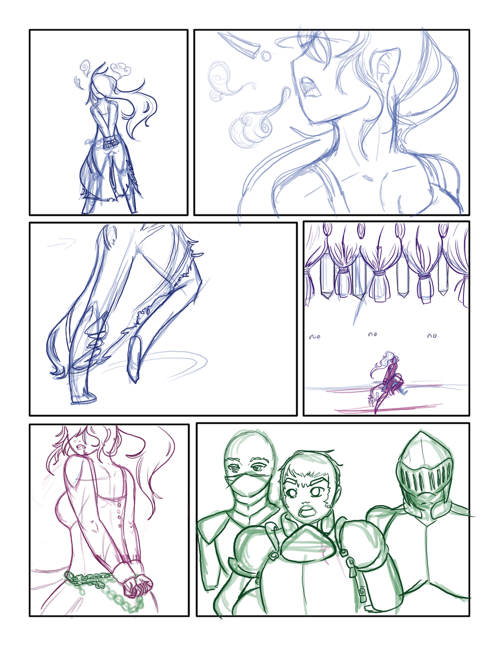
more details later. Hella sick.
Image size
1236x1600px 968.17 KB
© 2014 - 2024 flickrBLITZshimmer
Comments5
Join the community to add your comment. Already a deviant? Log In
bonjour bonjour, long time no see!
Now then, I'll go easy, seeing as how this is still a draft and all, but I am noticing a few problems design and focus wise, to which I hope to help clear things up!
1) those blank spaces should have a background, duh I know, but the back ground will give something to contrast our characters against, nothing too crazy though, a back ground only has to let the read know that hey, "she's running in a forest path in the dead of night"
2) character poses/position/ action can direct the viewer's attention which leads to
3) guiding the viewers attention from panel to panel, which can be thrown off easily we have a character running off towards the edge of the page (the bottom row is wonderful, add more detail to the background and it'll be lovely, as for the right middle panel, you might want to consider rearranging the composition so that the reader's eye does just go running off the page)
4)you might want to consider playing around with the camera's location to provide some variety that way we're not reading photos of a play but more something like a comic or stills from a film
it wouldn't be nice saying "oh this didn't work, do this instead", so I'll provide a link to a page from Mike Mignola's "Hellboy"
roberthood.net/blog/wp-content…
His art style is his art style, but he is very good at designing his pages. You start from the top left because of the dark mass and contrast of the light word bubbles, they lead down diagonally to the middle of the panel, and we see hellboy, red contrasting the larger green character, close up of his face, hand grabbing a spear, the background is coloured, so we know that we're in the same setting, and the characters are in life-like poses which look good, but because our word bubble attached the last panel to hellboy, we are naturally guided to it, and we then follow the movement and spear tip to the right side of the bottom row, the head and skull act as a bracket to stop the reader from being flung off the page, and then Mignola ends the page with some tom foolery which we can enjoy because of how Mignola has used the colours against tones, and the red/green colour compliments which make hellboy stand out because it is the warmest and most intense colour on the page.
Hope this helps, best of luck!